 "TheTurbochargedSquirrel" (thatsquirrel)
05/31/2016 at 16:22 • Filed to: None
 4
4
 11
11|
"TheTurbochargedSquirrel" (thatsquirrel)
05/31/2016 at 16:22 • Filed to: None | 4
| 11 |
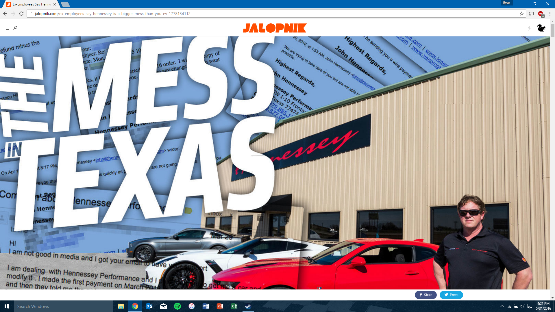
Don’t really see the point in making the lead image so large.
 For Sweden
> TheTurbochargedSquirrel
For Sweden
> TheTurbochargedSquirrel
05/31/2016 at 16:27 |
|
Millennials don’t read text; only images
 DrJohannVegas
> TheTurbochargedSquirrel
DrJohannVegas
> TheTurbochargedSquirrel
05/31/2016 at 16:28 |
|
It isn’t doing that on my browser...
 Urambo Tauro
> TheTurbochargedSquirrel
Urambo Tauro
> TheTurbochargedSquirrel
05/31/2016 at 16:29 |
|
I’m seeing it too. It might be a glitch, as if Kinja is having trouble resizing images or something. Then again, it could be some kind of “new & improved” feature...
Maybe tag your post “KINJA HELP” to see if they have any ideas?
 RamblinRover Luxury-Yacht
> For Sweden
RamblinRover Luxury-Yacht
> For Sweden
05/31/2016 at 16:29 |
|

|
TheTurbochargedSquirrel
> DrJohannVegas
05/31/2016 at 16:32 |
|
I am seeing it on chrome, firefox and Edge.
|
DrJohannVegas
> TheTurbochargedSquirrel
05/31/2016 at 16:34 |
|
I’m on Chrome, but maybe script blockers are doing the lifting for me...
 Patrick George
> TheTurbochargedSquirrel
Patrick George
> TheTurbochargedSquirrel
05/31/2016 at 16:40 |
|
New format we’re testing for big features. I welcome your feedback! Thanks all.
|
TheTurbochargedSquirrel
> Patrick George
05/31/2016 at 17:02 |
|
It’s a bit large. I am running a 1080p monitor and I can’t even see the whole image.
 StingrayJake
> Patrick George
StingrayJake
> Patrick George
05/31/2016 at 17:14 |
|
I’m not wholly against it. It follows in the footsteps of big features on other (not especially automotive) websites. It was a bit jarring though. Creatures of habit, I guess. I think with time it’ll be OK.
 scoob
> For Sweden
scoob
> For Sweden
05/31/2016 at 21:50 |
|
Yes we do!
We text each other all the time!
 FTTOHG Has Moved to https://opposite-lock.com
> Patrick George
FTTOHG Has Moved to https://opposite-lock.com
> Patrick George
06/01/2016 at 17:33 |
|
I like it for feature articles. Two things could make it even better: 1. The main body text column could be a little wider - like another two or three words per line. 2. Make the text “roll-over” the images as the user scrolls... this is what ESPN does on their feature articles and it makes it flow better as you read ( example ). I know this is probably more of a Gawker/Kinja thing that something you have control over, but it is on the right track.